TileHaus
TileHaus was founded by Louise and Renee Jacobsen to make tile shopping easy and inspiring, giving customers more time to create a home they love. We developed the brand identity, website, and supporting materials to bring their vision to life through a colourful, approachable design.
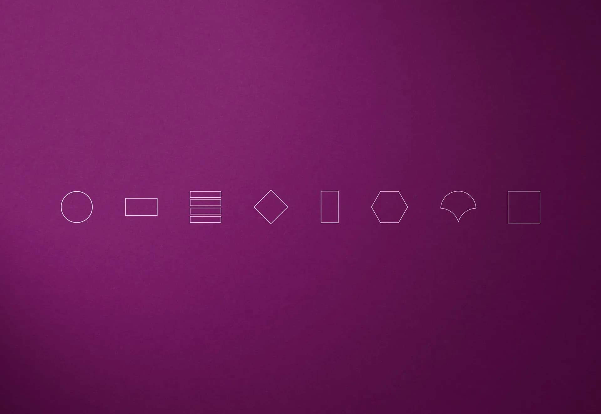
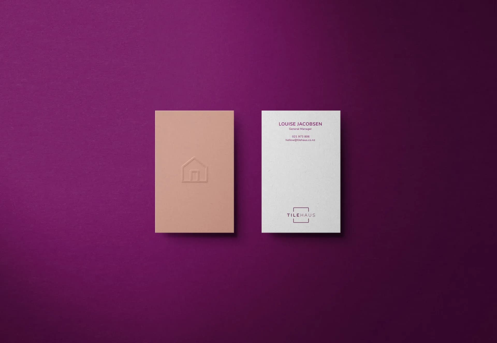
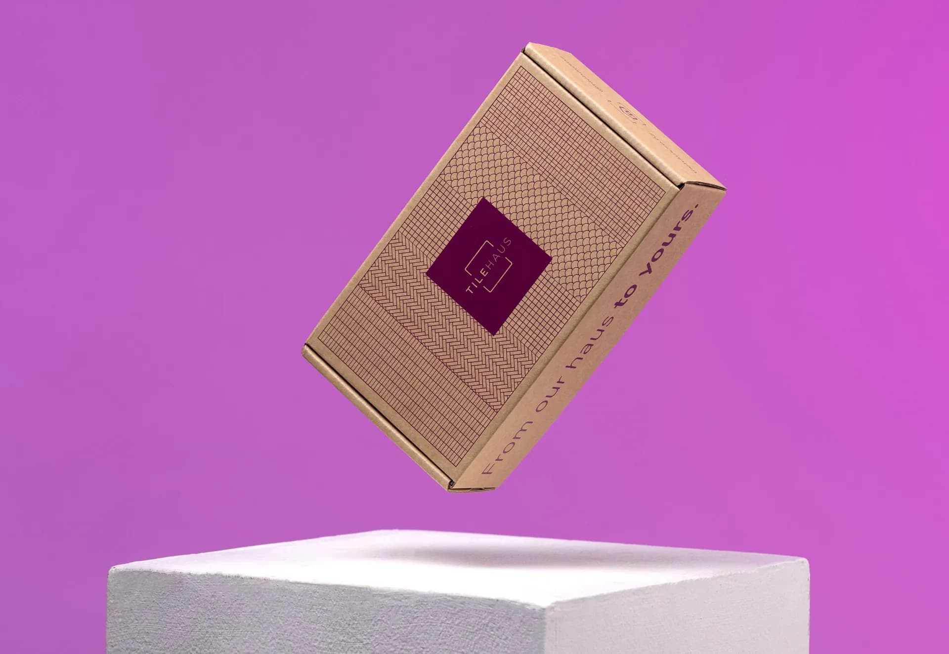
A vibrant purple anchors the identity, giving TileHaus a distinctive presence within the industry. Simple illustrations and playful graphic elements create a recognisable visual language, balancing personality with clarity across the brand.
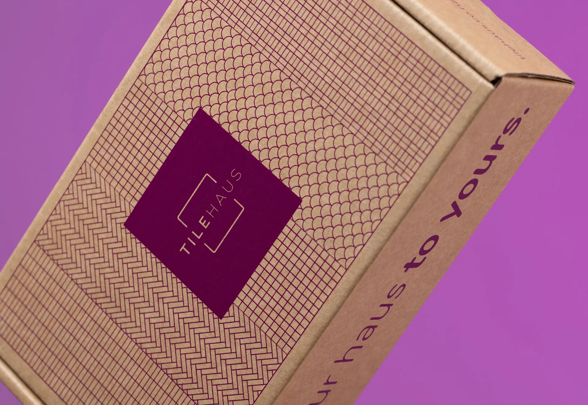
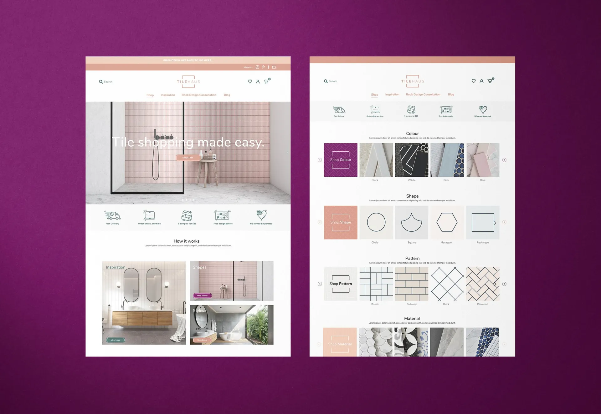
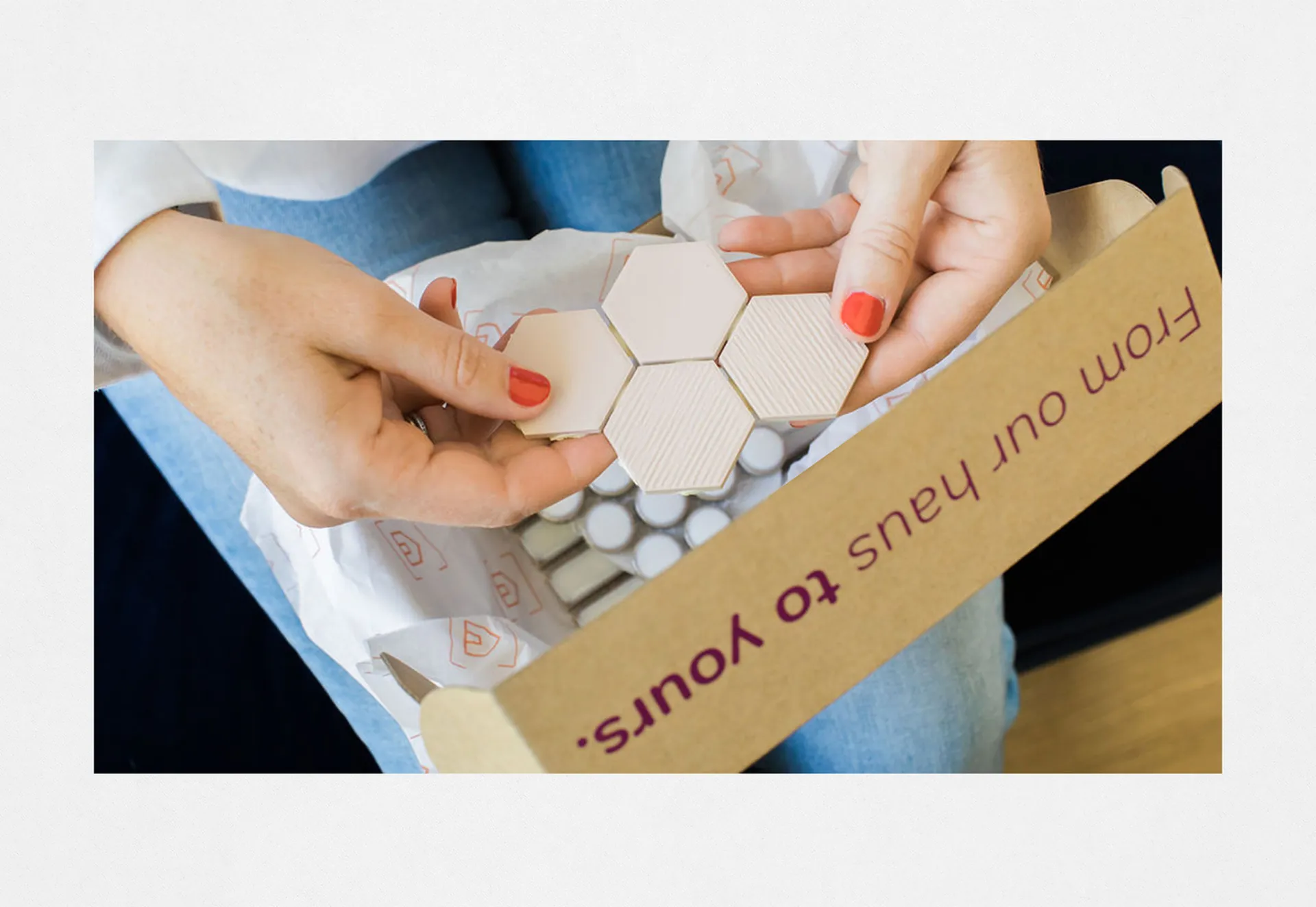
From the website to print and packaging, the design creates a consistent experience at every point of contact. Each application carries the same character, making the process of discovering and choosing tiles feel welcoming and engaging.
- Sector
- Retail / Interiors
- Discipline
- Brand Identity, Illustration, Website, Print, Packaging, Photography Direction
- Location
- New Zealand
- Contributors
- Louise Jacobsen & Renee Jacobsen
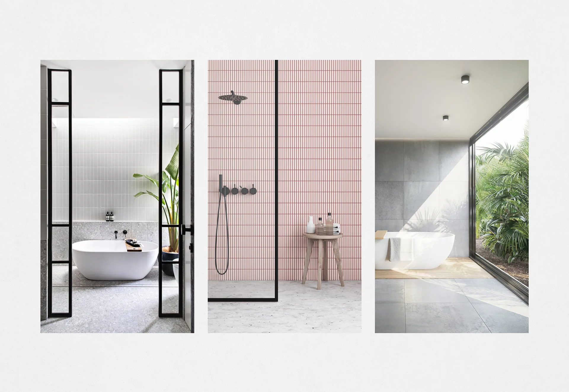
- Photography
- Graeme Murray
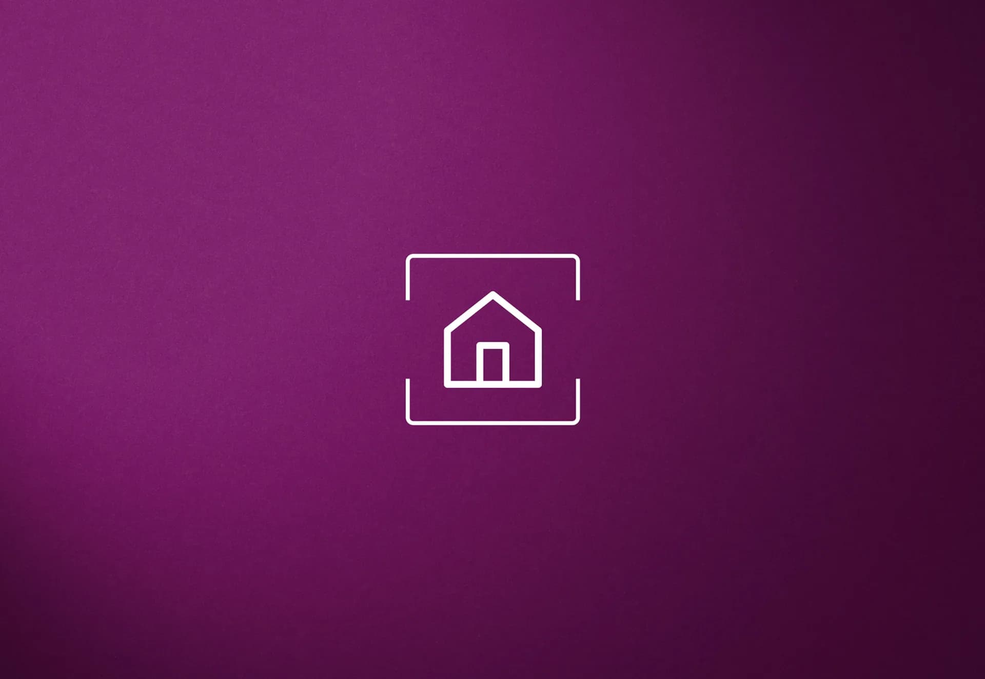
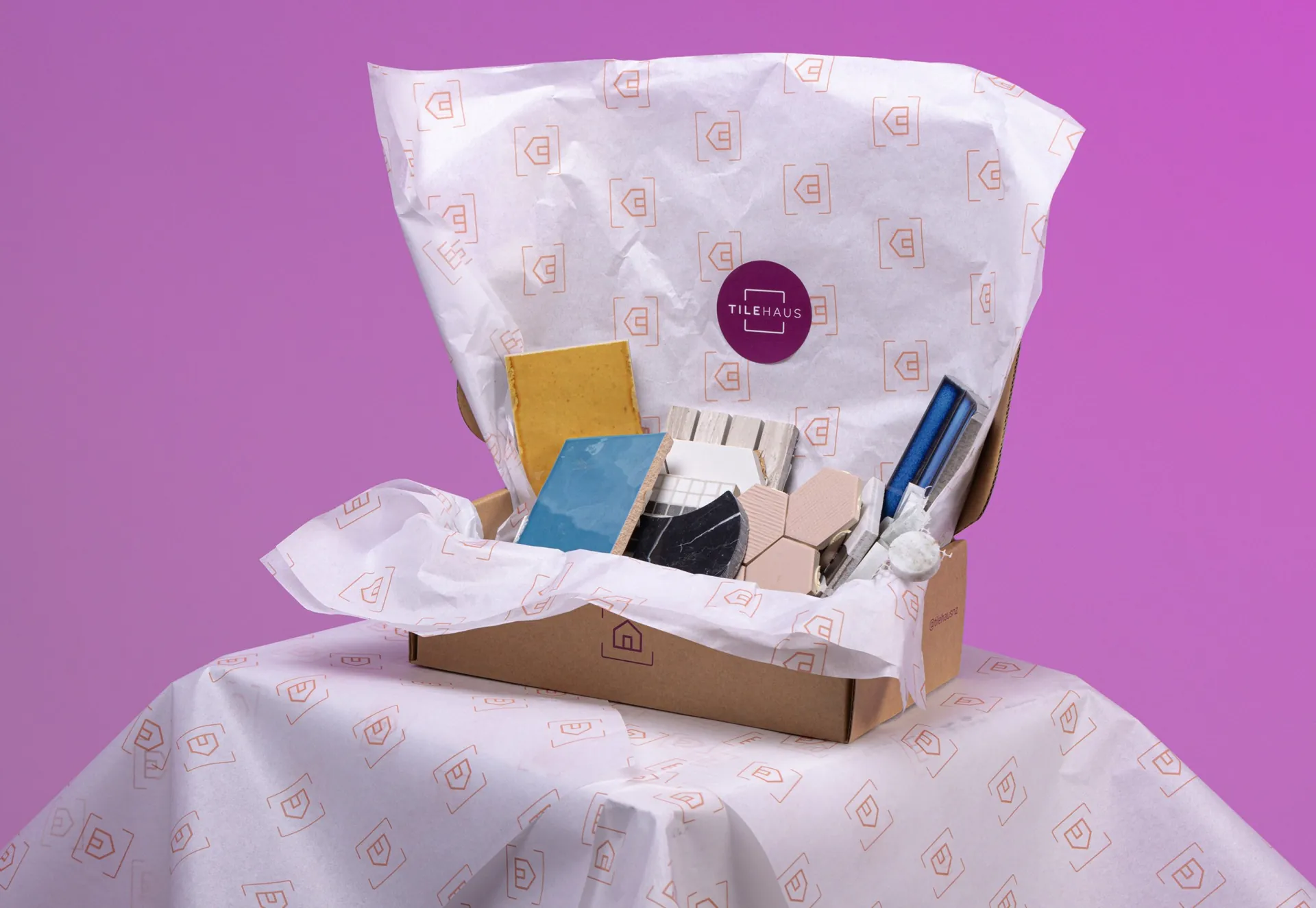
We carried TileHaus’s vibrant purple and playful illustrations across the website, print, and packaging to make choosing tiles feel approachable and the brand easy to recognise.