Drips.
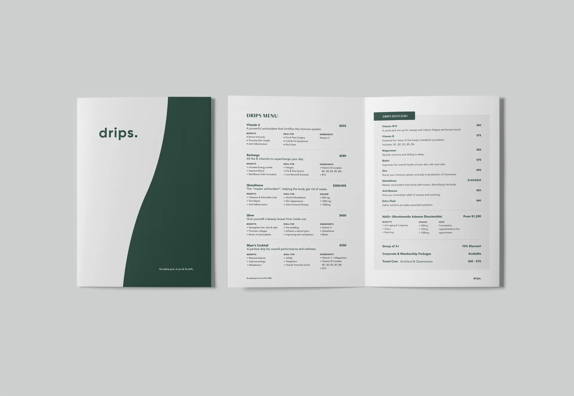
Drips is a mobile IV and concierge medical service focused on wellness and preventative care. We developed a brand identity and website to build confidence in a growing healthcare category in New Zealand.
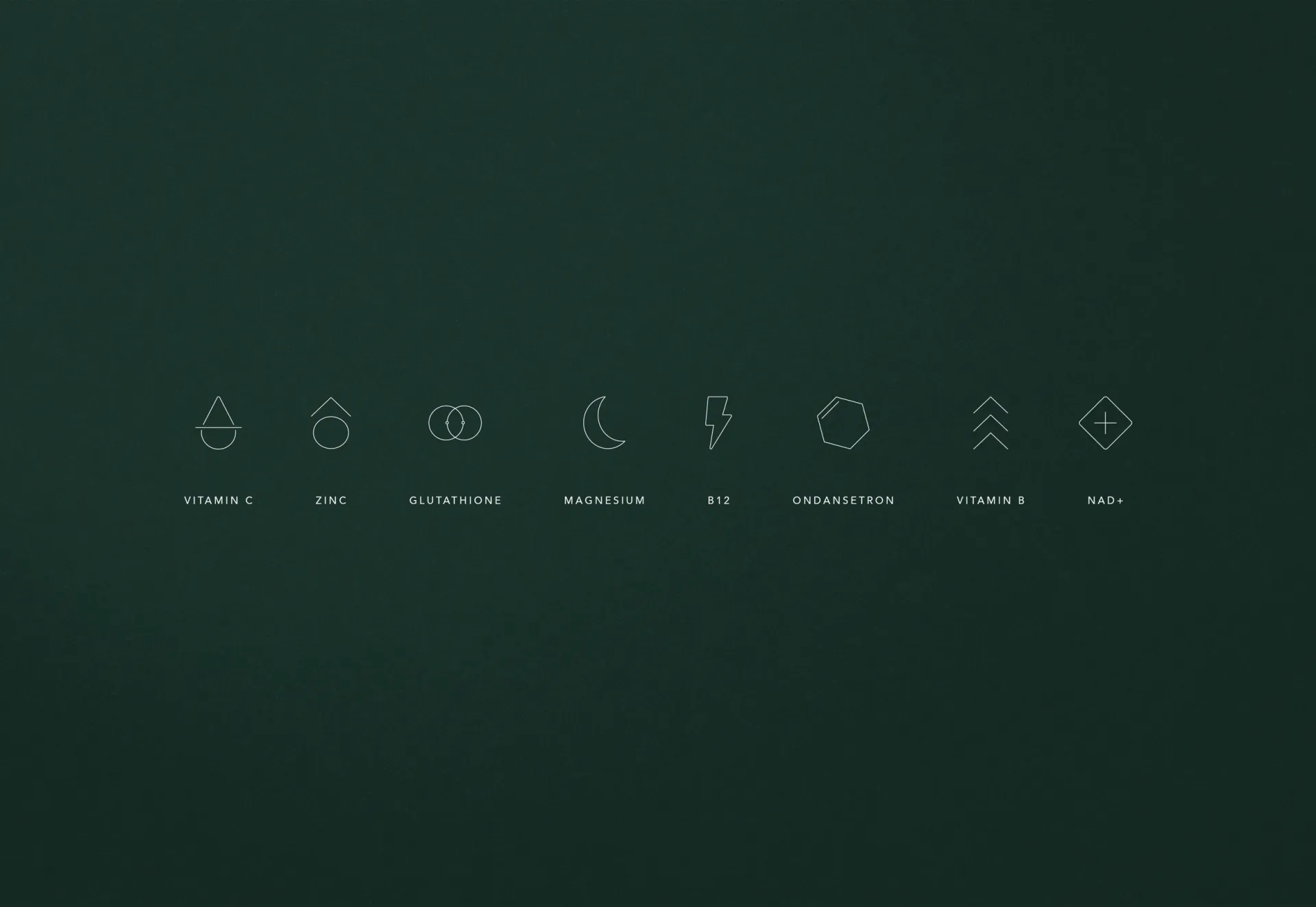
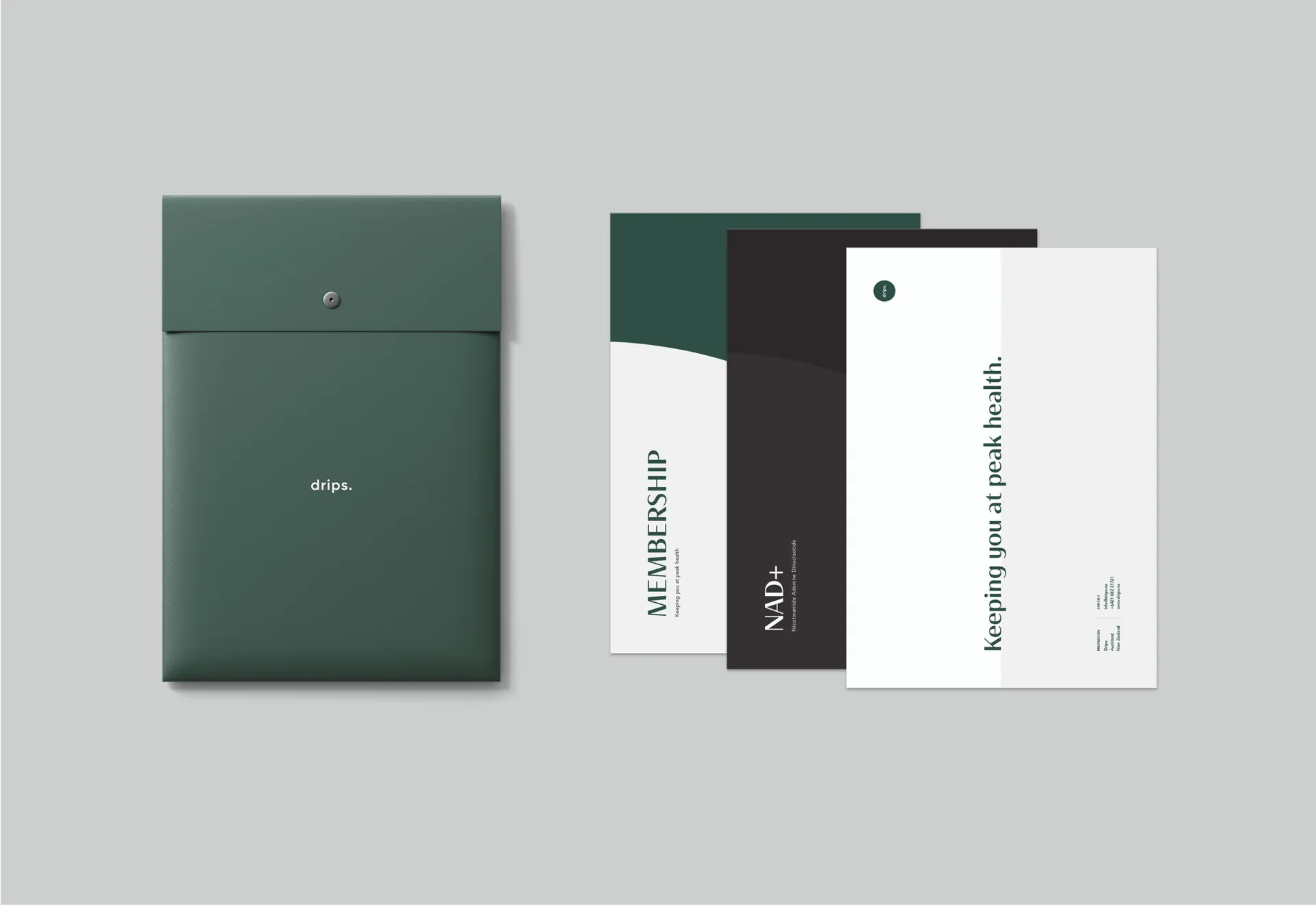
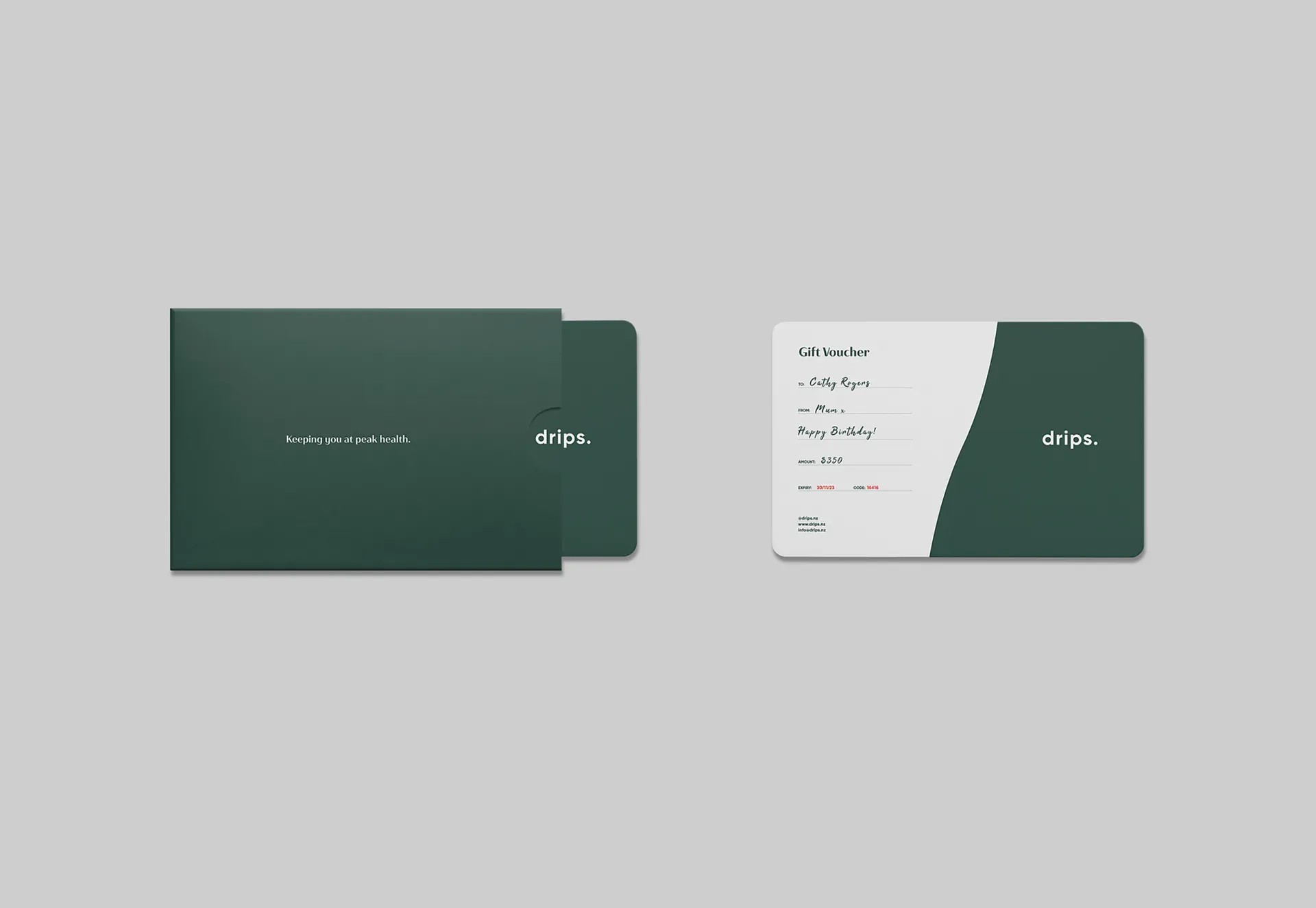
A calm green palette, clean typography, and a minimal design system balance clinical credibility with a contemporary approach to wellness. The identity extends across illustration, brand guidelines, and print collateral, supported by a streamlined website.
Together, these elements give Drips a clear, cohesive presence from launch.
- Sector
- Healthcare
- Discipline
- Brand Strategy, Brand Identity, Website
- Location
- New Zealand
- Contributors
- Jen Ng
- Photography
- Graeme Murray
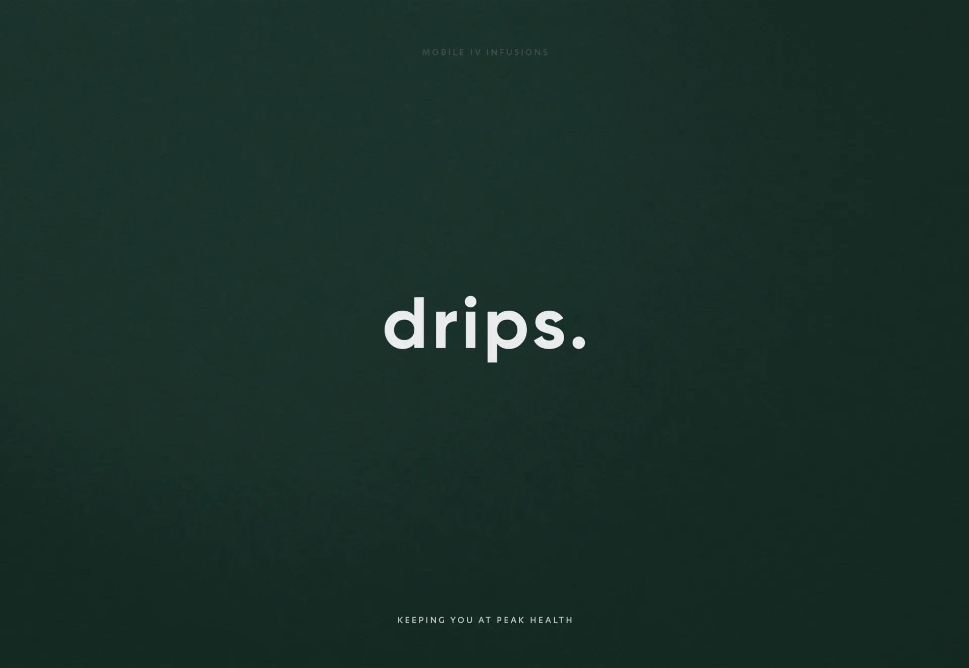
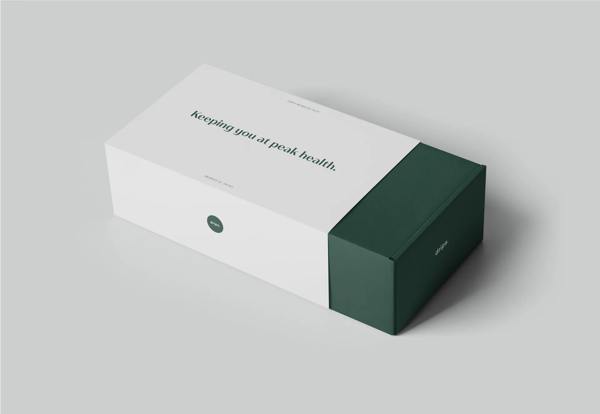
We used calm colour and clear typography to make Drips feel approachable and credible, helping customers navigate an unfamiliar healthcare service with greater confidence.