One Dose
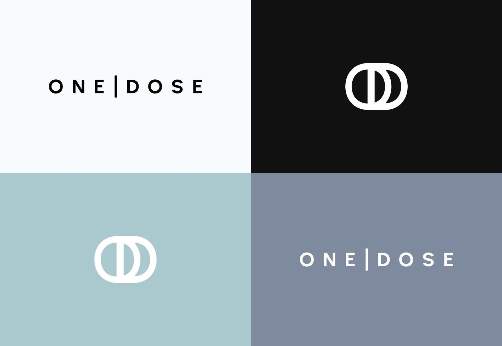
One Dose is an Australian pool care brand simplifying the way customers test their water and order treatments. We developed the full brand identity, including the logo, packaging, and app interface layouts, creating a consistent experience across physical and digital applications.
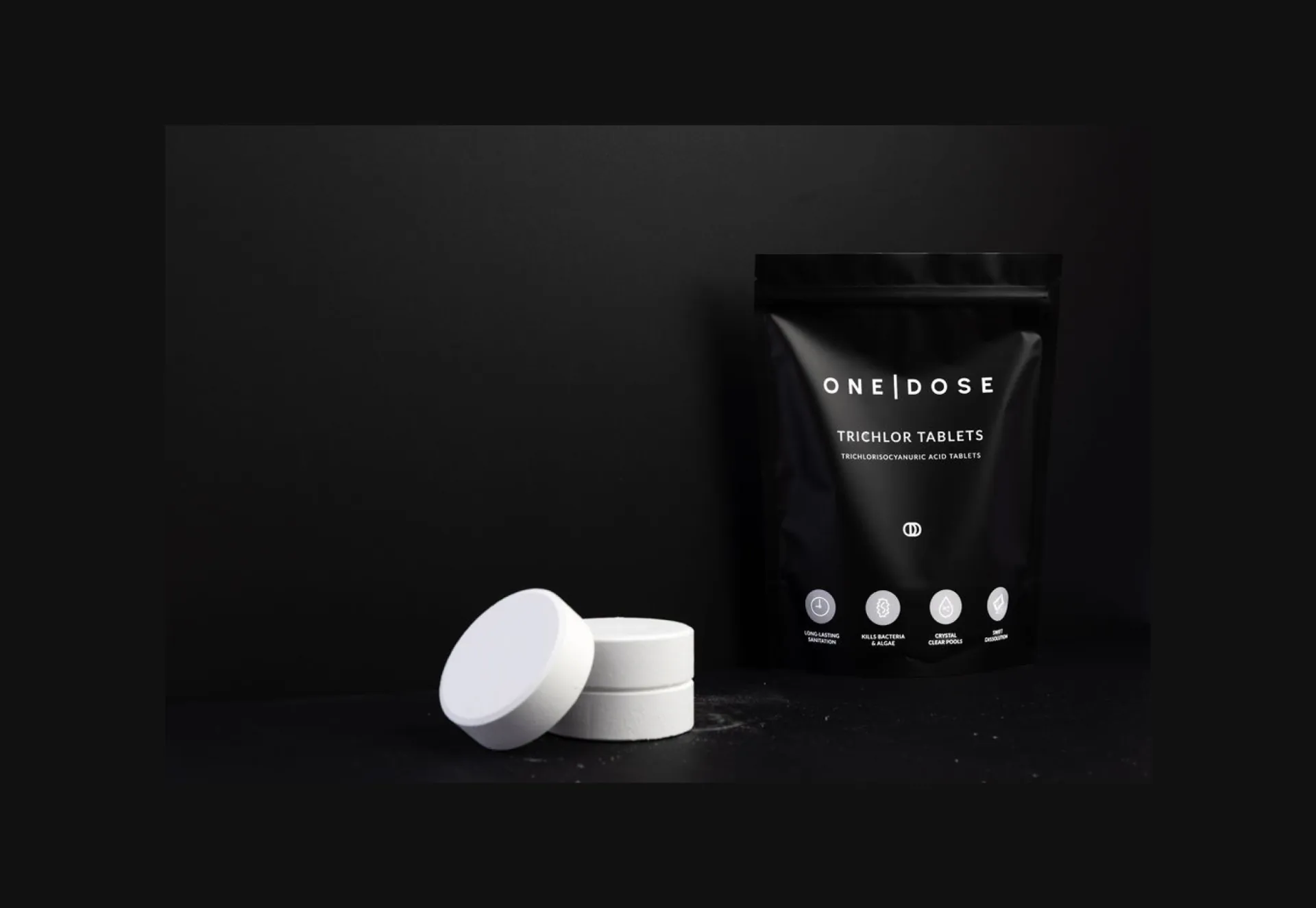
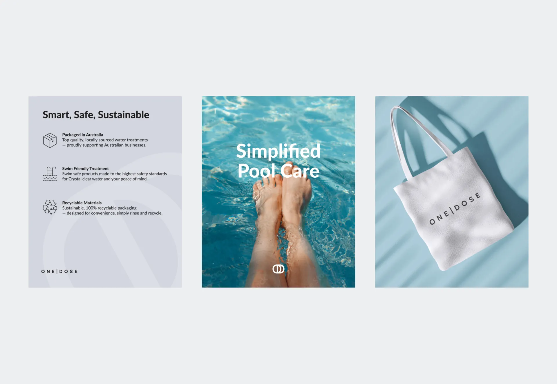
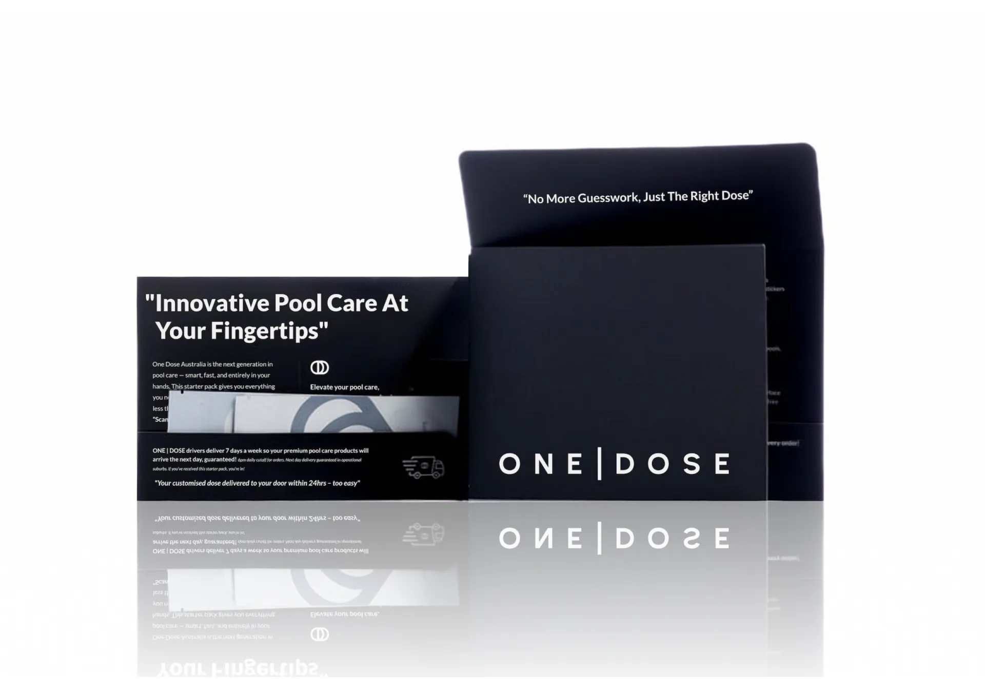
The design brings a clean, contemporary approach to a technical category. Clear typography and an organised information hierarchy make the brand approachable, carrying a consistent visual language across the starter mailer, test-strip packaging, and chemical pouches.
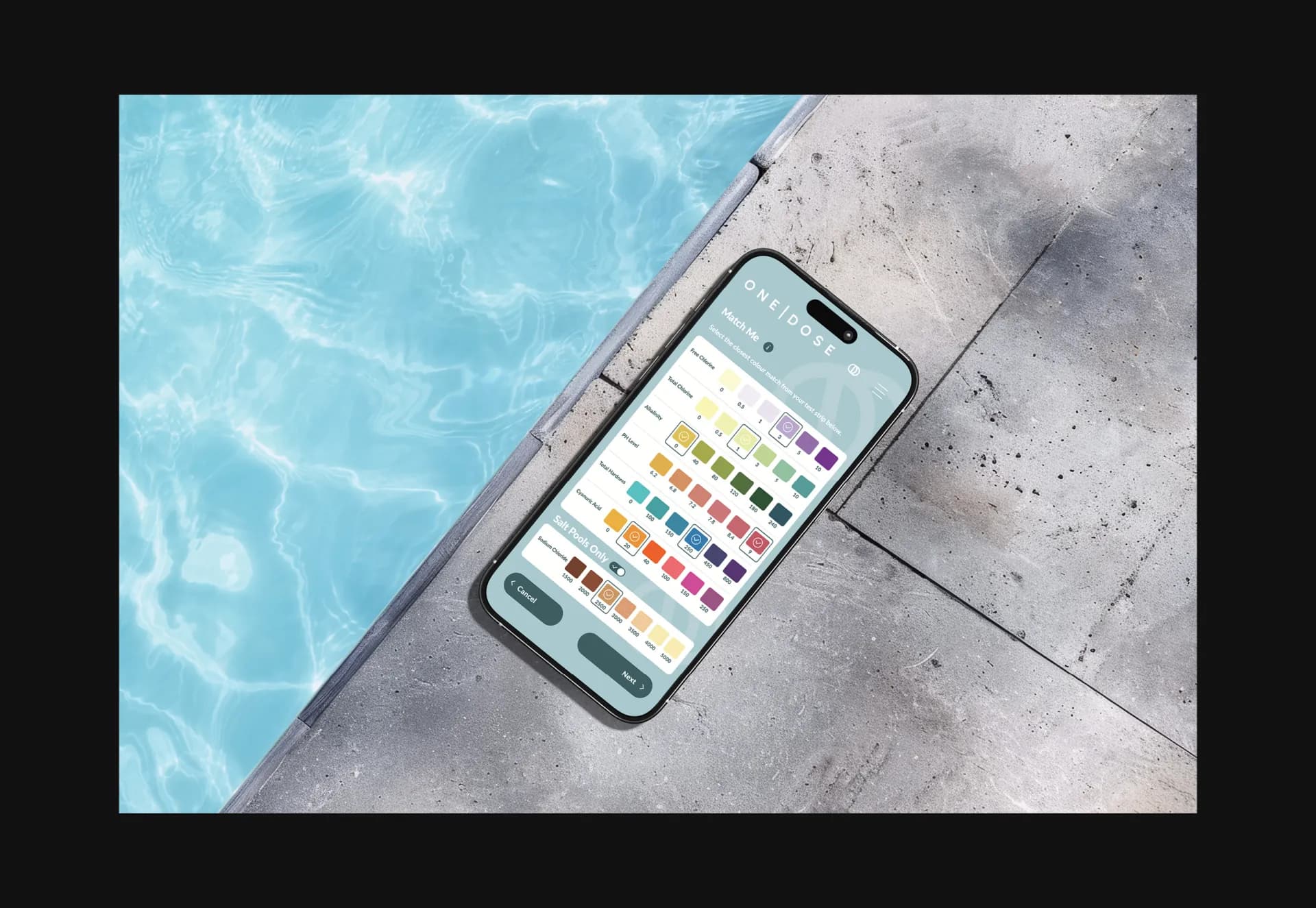
The app interface extends this thinking into the testing and ordering process, helping customers move from matching their test-strip colours to finding the appropriate treatment. Together, the identity, packaging, and interface make each stage feel connected and easy to follow.
- Sector
- Pool Care
- Discipline
- Brand Identity, Logo Design, Packaging, App Interface Design
- Location
- Australia
- Contributors
- Christine Neshat, Nicholas Robertson, Jake Taylor
- Photography
- Bleo
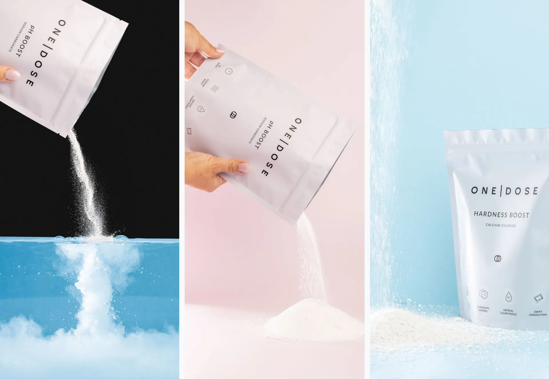
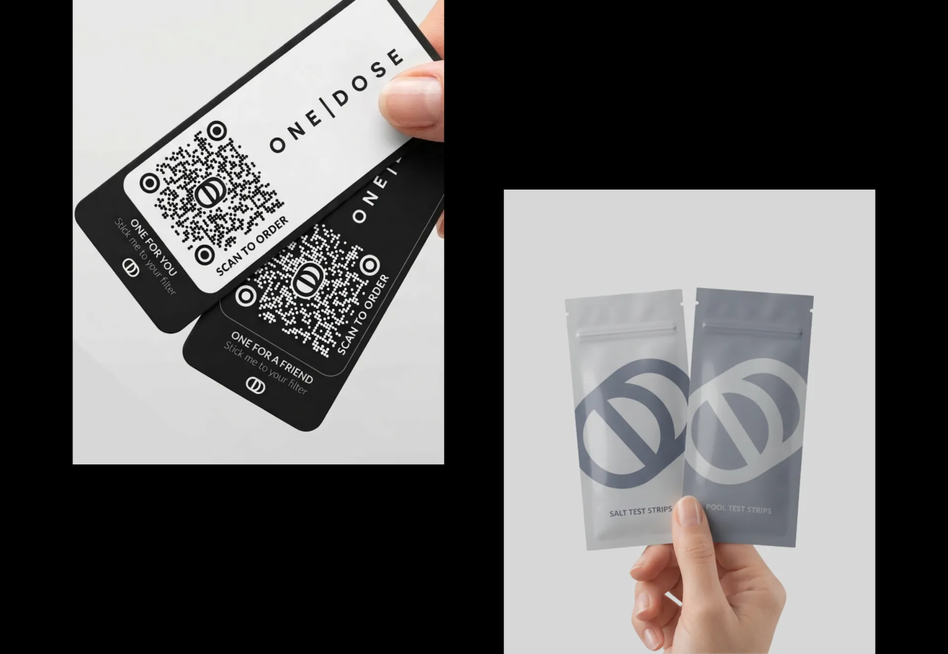
We connected the identity, packaging, and app layouts through one clear design system, helping customers understand the process and move more easily from testing to ordering.